Showing posts with label design. Show all posts

Sunday, September 11, 2011

MORE Hand-rolled Paper (recycled) Bead Earrings

Original article with 27 other designs.

This set:
Hooked on recycling, Choleena made rolled magazine-paper beads, and used reclaimed beads from old jewelry, as well as reclaimed wire in these particular earrings. If you look closely, you'll see that the bead cap near the bottom has been flattened and trimmed into the shape of a flying insect. As these are all one-of-a-kind, you will be the only person in the world with these unique earrings.


$16


$16


$16


$16


$16

Monday, June 20, 2011

Marketing Monday

This week's column celebrates Apple, an incredibly innovative company from advertising to technology to industrial design.
The Evolution of Apple Advertising by LinkedIn.

Marketing Monday is a column devoted to innovation in the world of commerce. It celebrates companies, products, packaging and campaigns that swim against the current and find creative ways to stand out. Got a suggestion for the column? Send me a comment.

Sunday, May 29, 2011

Old Jewelry Needed for Art Project

Old Jewelry Needed for Art Project: Will pay for or take donations of old jewelry (even clip-on earrings!) for a recycling-based art project. Anyone need to clean out their old jewelry box? Bring it on!

Tuesday, March 01, 2011

ROM "travel" ad

To lure the local public to permanent exhibits at the ROM, I proposed a mimic of the common travel ads found in newspapers. I developed the concept, wrote, and designed the ad.

Saturday, October 23, 2010

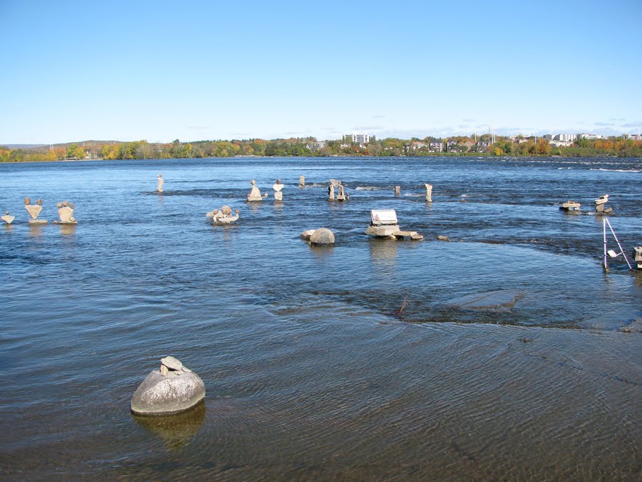
Ottawa Riverbank rich in inukshuks and fossils

What an incredible shoreline the Ottawa River has. How ironic that it's lined with fossilized patterns and creatures of older river beds. Every year in September, artists flock to the shore to make inukshuks with this fossilized rock. From what I can tell, the artists challenge themselves to choose oddly-shaped/weighted and fine-pointed rocks. In some close-ups, you can see that they've used tiny rocks to wedge/shimmy things into place.

On this visit, many of the inukshuks have fallen victim to wind and rising water. Unfortunately, I didn't think to bring my camera on my first visit and so aren't able to show you some of the more impressive ones that were such bold balancing acts that I was afraid my simple act of observing might cause them to collapse.
Millions of years from now, will paleontologists find these odd, anachronistic configurations of fossil and wonder what happened?
• Wikipedia "Inukshuk"

Monday, May 03, 2010

Marketing Monday

New Doritos "Collisions" chips a direct hit
Love the packaging, love the idea and love the two kinds of chips they've put together. Perfect for parties where you know some people like it hot and some not. What a smart, new way to sell two old flavours.

Marketing Monday is a column devoted to innovation in the world of commerce. It celebrates companies, products, packaging and campaigns that swim against the current or find creative ways to stand out. Got a suggestion for the column? Send me a comment.

Monday, April 19, 2010

Cute Little Cartoon About the Nature of Confidence

I love how this little bug asserts himself to the point of pushing the rooster into the corner of the comic box. The bug and rooster have undergone a role-reversal. Even their font (and therefore, voice) has been swapped. The bug, usually prey to a rooster, admits his mortality with the squished "ouch" but never lets the rooster get the better of him. The rooster, commonly a symbol for blustery pride allows the bug to demote him.

Friday, April 09, 2010

Beautiful Little Houses and Cottages


Ross Chapin Architects designs beautiful little houses and cottages. Perfect for small families or those thinking of downsizing their living space. In an environmentally-conscious world, these homes are a cozy way to celebrate being Green! They even design garages and studio.

Wednesday, March 31, 2010

Wednesday's Words of Wisdom

The best way to accomplish serious design is to be totally and completely unqualified for the job... Why can't the sign be on the floor? New Yorkers look at their feet."

— Paula Scher in her talk "Great design is serious (not solemn)" at TEDTalks

Via Tantramar Interactive's YouTube Channel.

Tuesday, March 23, 2010

National Gallery of Canada Creative Brief and Brochure

I was recently asked by the Volunteers' Circle of the National Gallery of Canada to develop a Creative Brief & Rationale as well as design for a new promotional brochure. Here it is edited for length and privacy.

Creative Brief

Background:
After serving 50 years and managing over 300 volunteers in 2009 alone, The Volunteers’ Circle for the National Gallery of Canada has reached a point in their growth where they require a marketing approach for their brochure. The Circle needs to lure more volunteers with eclectic backgrounds and varying ages as well as lure more participants to programs.

Goals and Expectations:
Primary Goals
• To increase participant numbers in the Circle’s programs
• To create a brochure that reflects the Circle’s high-quality program line and important role in supporting the Gallery
• To increase volunteer numbers within the Circle — with a focus on volunteers with eclectic backgrounds and varying ages to fill the ever-changing needs of the Gallery

Secondary Goals
• To provide marketing support for the Circle team
• To increase general knowledge of the Circle’s programs
• To increase Gallery Membership

Target Audiences:
Primary Audience:
• Ottawa-Gatineau area residents looking to study art, informally
• Ottawa-Gatineau area bilingual residents looking to volunteer

Secondary Audiences:
• Schools and students in the Ottawa-Gatineau area
• Volunteers’ Circle promotion team
• Gallery promotion team

Perception and Tone
1. Desired Response: The Volunteers’ Circle is:
• Quality-conscious, professional, reputable, reliable
• I can trust the Volunteers’ Circle to organize and roll out a high-quality program

2. Tone:
• Professional, personable, helpful, educational, rich in heritage and culture

3. Usability Guidelines:
• The brochure should supply enough information to act as a lure to other support materials such as the web site
• A bilingual brochure will speak to French and English audiences

4. Physical Guidelines:
• Reduction of the brochure to letter-sized and 3-panel will help offset the increased costs of colour

5. Design Guidelines:
• Clean, simple, attractive design
• A colour palette that is reminiscent of the Masters’
• Textures that make the brochure feel like an artwork itself
• Circular design elements to reinforce the concept of a ‘fully-rounded’ experience
• The addition of photographs to represent the experience of participating


6. Design Recommendations:
• The Volunteers’ Circle should move away from the black and white brochure. This will distance the Circle from the competition (other volunteer groups that take away your ability to select from the best people) and create a friendlier feel. It needs a colour palette and design that is deserving of a National Gallery affiliate.
• Photography, design and writing should emphasize lifestyle – the benefits of volunteering or participating, i.e. higher learning, beauty, rewarding experience, friendship

Communication Strategy:
• Front panel will include a photograph and headline that addresses the dual nature of the brochure — a promotion of both studying art and volunteering
• Interior panels will provide a brief lure for all programs and volunteer opportunities
• Contact call-out area with web address for further information
• The introduction of Testimonials will strengthen the concept of a rewarding experience
• A bilingual brochure will attract both French and English audiences without having to print 2 brochures

Monday, March 08, 2010

Marketing Monday

ROM is the Bomb
I've always been in love with the Royal Ontario Museum, their identity included. Today's column covers their exciting logo which incorporates an icon (the visual or graphic component) and a wordmark (the text or company name component).

• the ROM acronym is in solid, authoritative letter shapes but with a very slight serif to indicate refinement
• they've used full-intensity blue, gold and red; indicative of a regal colour palette
• funky shapes jut out from behind the letters to mimic the building's exciting architecture and comment on its modernity
• and it uses a wordmark component to spell out their full name so there's no mistaking what and who they are


So simple. So good.


Marketing Monday is a column devoted to innovation in the world of commerce. It celebrates companies, products, packaging and campaigns that swim against the current or find creative ways to stand out. Got a suggestion for the column? Send me a comment.

Monday, February 15, 2010

Poisoned Milk -- don't you just feel like this some days?

If you like automata, you'll love this little critter from the Cabaret Mechanical Theatre.

Have a great day!

Wednesday, February 03, 2010

The Sweetest Little Thing — Worthy Fundraiser

Support galleries and artists at The Sweetest Little Thing (SLT) Art Auction. Come on, it's fun!

• The Sweetest Little Thing
• Art Auction, Cakewalk, Dance
• February 14th
• 7 PM
• Owens Art Gallery, Sackville, NB
• See the artwork and bid online at www.SweetestLittleThing.ca
• Official web site of the Struts Artist-Run Gallery
• Official web site of the Owens Art Gallery

To do my part, I created the 2010 stamp for their ongoing Rubber Stamp Project. This stamp was used on the envelope to call for SLT submissions and related promotions.

The rubber stamp:


Here's what it looks like when it goes through the stamping process:


Creative Rationale for the Stamp
Each year, a member of Struts is asked to create a new stamp. The resulting graphic is a reflection of the Artist's approach to art as well as their response to the theme Sweetest Little Thing.

Personally, I'm a bit of a science fiction movie junkie (thus the 2010 movie reference), I'm a Graphic Designer (thus the adaptation of the movie's poster) and I love a play on words (thus the planet's crescent turns into a croissant, which is the French word for crescent). I think this stamp wraps me up well.

In terms of relating the image to the theme: babies are sweet little things; croissants are sweet little things; the event itself focuses on dessert-type foods; and, the auction takes place on Valentine's Day -- it doesn't get more romantic than French language and food.

Here I've re-used the stamp for the SLT poster:


Creative Rationale for the Poster
As the stamp graphic was meant to be seen only after it had gone through the process of being stamped, people would see a "grunge" version of that graphic. I decided to take the poster in the same direction. All the elements of the poster look like they've been stamped onto it. Some are rough-edged, some are misaligned — all properties of a hand-made stamp project. Adding a red background recalls Valentine's Day.

Animated .gif
Here, I've adapted it to an animated .gif for promotional use on other web sites:


Background on The Sweetest Little Thing
The Sweetest Little Thing is the most important annual fundraising event for The Owens Art Gallery and Struts Gallery & Faucet Media Arts Centre. Presented in partnership on Valentine’s Day, the Sweetest Little Thing combines a contemporary art auction with a cake walk and dance. The event has become a seasonal highlight for the community, featuring artists, friends and supporters from across the country and beyond. The funds raised go directly to the ongoing programming of the galleries.

Background on The Rubber Stamp Project
The goal - to stamp all outgoing mailings with an artistic image that will intrigue postal workers. The image must fit on a standard #10 envelope and must lend itself well to the mechanics of the stamping process. The image is often related to Valentine's Day since the stamp is launched annually on the mailout containing the call for submissions to The Sweetest Little Thing — a yearly art auction held on February 14th.

Monday, August 10, 2009

J'aime les Jems [sic]

Today I came home to these little treasures...
I love kidsitting. They made everything, including the box! The foam is a chunk of an old memory foam mattress.

And, don't you just love the name of the jewellery business? They created an icon and everything -- it's a complete logo! Awesome.

Monday, February 23, 2009

Tiny House; Big Living


The Tumbleweed Tiny House Company has developed a home for people who want to live large in a small house. Simply because of it's size, you'll be able to save all kinds of money on the construction of it. Plus, you'll be reducing future costs of heating and electricity. Not to mention the high you'll get from your seriously-reduced impact on the environment.

Look at this cutie! The B-53 is 837 square feet. Its two levels gets you 2 bedrooms, 2 bathrooms, dining room, kitchen, and living room with optional 3rd bedroom. All on a scale that works for that small-family trend these days. Check it out on SmallHouseStyle.com or go directly to the Tumbleweed Tiny House Company web site.

Sunday, January 27, 2008

Food Company's Annual Report has to be Baked to be Read

Printed with invisible thermal-reactive ink, this food-company annual report called "Well Done" must be baked before the content of the pages will show up! Kudos to the creative agency Bruketa & Zinić who cooked up this recipe for success. I'm sure they've made their client proud.

Even the Biohazard Symbol Needed Design & Marketing

Biohazard SymbolCharles Baldwin, a retired environmental-health engineer, explains his role in developing the biohazard symbol from colour and shape selection to test audiences and "selling" it through scientific journals.

~via Reddit~

Tuesday, January 08, 2008

Mostra Unusual Typeface

The Marc Simonson Studio, a digital Type foundry, has found inspiration in 70-year-old Art Deco typefaces. The resulting face “Mostra” is a beautiful homage to 1930’s hand-lettered posters and advertising.

Three sets are available offering some characters with different variations to give your designs just the right look. The character sets are included with each weight. Five weights range from Light to Bold to, as they say, “ridiculously Black”. Mostra features a full character set including the oe ligature (as is required for words like the French “oeuf”). Caps only; kerning tables for display setting.

The entire face in all weights is available for viewing in a unique, interactive interface on the Marc Simonson Studio web site.

Starting at $29, this typeface is worth it’s weight; bold or italic. ;-)

Via Daring Fireball.

Sunday, December 30, 2007

Truly Royalty-free, Inexpensive Photography

Stock Photos, Royalty Free Stock Photography, Photo SearchBig Stock Photo offers an impressive repository of over 1,600,000 photos and artworks downloadable in digital format from their web site. And, if you're in the biz, you'll enjoy an alternative to some of the established bigger companies. I like the company so much that I became an affiliate!

The site offers excellent features/services:
-- Truly royalty-free photography
-- Extremely reasonable prices ($2.50+ USD each)
-- Low, medium and high resolution
-- Purchasers manage their own account, create wishlist
-- Purchasers can submit theme requests
-- Keyword search plus “see similar” links
-- Pay by credit card or PayPal and download files instantly
-- Special licensing agreements available for special usages
-- Photographers: manage your online account; receive 20+%
-- Designers: some object-based photos have clipping paths!

Friday, December 28, 2007

Volkwagen Drives Advertising

In 1959 Volkswagen changed the face of advertising. They selected Doyle Dane Berbach (DDB), an advertising agency based in New York, to create a Print and TV campaign to promote their vehicles across the United States. In doing so, VW, the agency and Helmut Krone (the Art Director behind it all) secured their place in advertising history.

Thankfully, three ad-men/authors --Alfredo Marcantonio, John O'Driscoll, and David Aboott-- saw fit to compile the advertisements into an equally clever book. Entitled "Remember those great Volkswagen ads?", this book has a web site devoted to it and is a must-have for all those who work in the biz. As it's currently out of print, be sure to sign up for notification when the new edition is printed. Enjoy!